Kalamazoo TMS
& Behavioral Health
A behavioral health clinic in Portage, Michigan needed a clearer identity and an easier route to request care. We brought the brand, website and ongoing content together around that first patient contact.
- Client
- Kalamazoo TMS & Behavioral Health
- Location
- Portage, Michigan
- Sector
- Behavioral health
- Work delivered
- Brand identity & guidelines
Website design & development
New-patient, refill & referral forms
Content writing & SEO
Weekly blog publishing
Website maintenance
Social media design, content & management
The first appointment was hard to reach
For Kalamazoo TMS & Behavioral Health, the website was often the first introduction to the clinic. Someone considering an appointment needed to understand the services, check practical information and find the right way to contact the team.
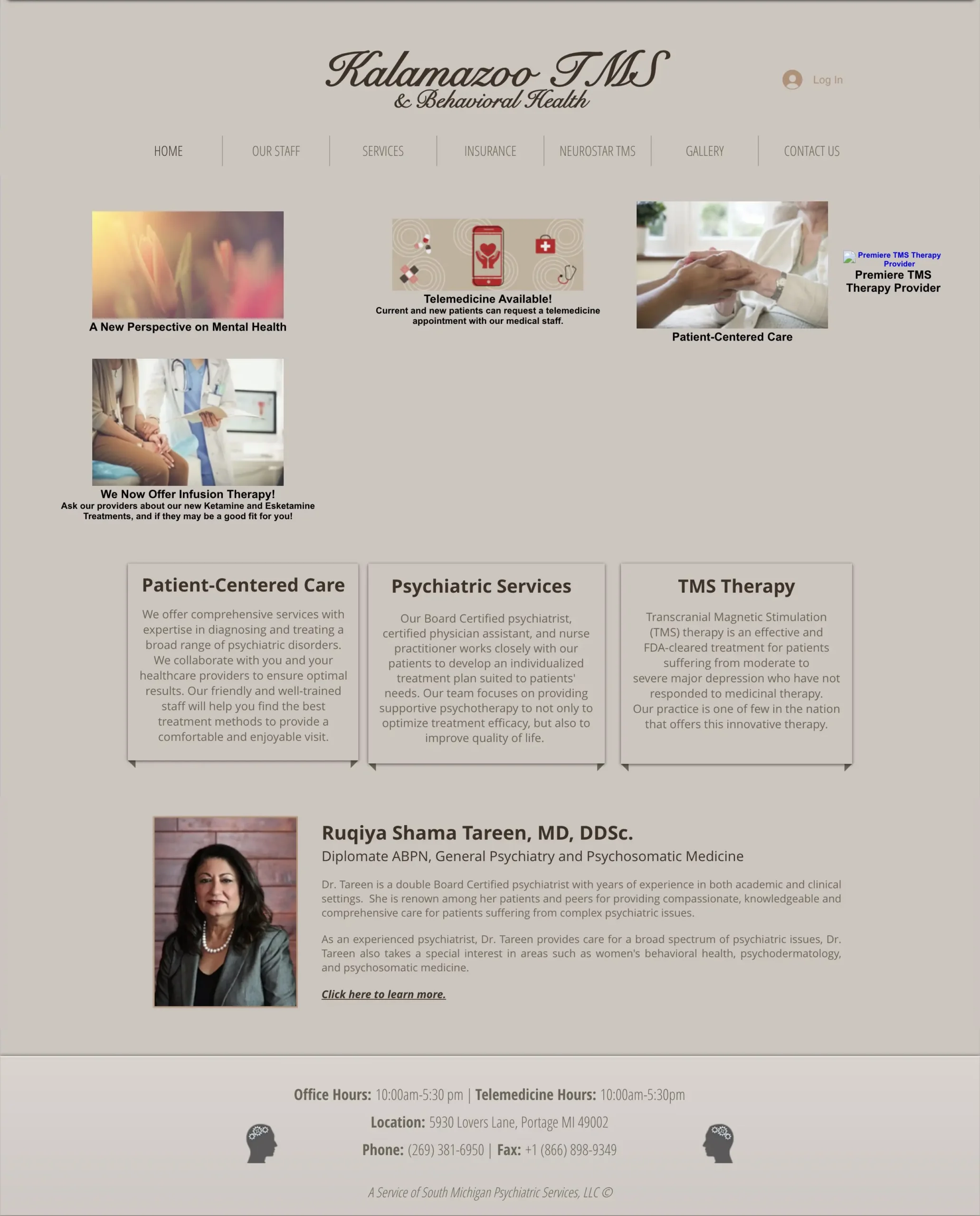
The project began with a dated website and an inconsistent identity. The clinic reported that the old site was not indexed in Google, and the appointment path was difficult to follow. That made the website a poor starting point for someone trying to arrange care.
A clearer introduction, followed by a useful next step
We developed a unified brand and rebuilt the website around the decisions a visitor needs to make. The service structure explains what the practice offers. Insurance information is available before an inquiry, and three distinct forms separate new-patient requests, prescription refills and provider referrals.
The work continues through SEO, weekly articles, website maintenance and social media management. Each channel carries the same identity and points back to information the clinic can keep current.
The starting point
The supplied previous logo and the archived November 2023 homepage show the earlier presentation. The archive preserves the old layout, although a few images were not retained. The capture below shows the website without the Internet Archive toolbar.
An identity the clinic could use consistently
The new identity combines a head-and-brain mark with the full clinic name. Blue and green accents carry into a clear logo family, with horizontal, vertical and icon versions available for different formats.
The brand guidelines bring the palette, Poppins typography, spacing and image direction into one reference. A newly designed cover introduces that guide below.
KALAMAZOO TMS / ORIGINAL FULL-COLOUR LOGO
KALAMAZOO TMS / WHITE LOGO VERSION
The website began with the patient journey
A clinic website has to explain the practice before asking someone to share their details. We planned the structure and navigation first, then worked through search topics, writing and design. The six stages below show how those decisions connect.
Business taxonomy
The practice’s services needed an understandable structure. Core psychiatric care, interventional treatments and specialized programs have distinct places, alongside the team, insurance and contact information.
Navigation experience
A visitor can explore a service, meet the team or check insurance before requesting an appointment. Separate contact destinations make new-patient, refill and provider-referral needs easier to distinguish.
Keyword research
Search planning separates local clinic and service topics from informational questions. Service pages give each subject a home; articles address practical questions about appointments, insurance and treatment evaluation.
Competitor analysis
Website research considered how clinics explain their services and present the steps toward an appointment. The structure keeps service information, practitioner details and contact routes easy to evaluate.
Content writing
We wrote the website content and continue publishing weekly blogs. The copy explains the practice’s services and practical appointment information, with clear links to the appropriate next step.
Design research
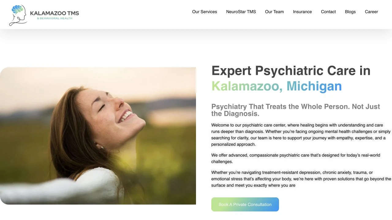
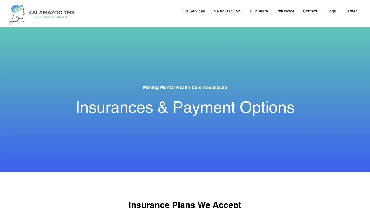
The layouts carry the new logo, blue-green palette and consistent typography onto the screen. Page hierarchy gives service information and appointment requests a clear place on desktop and mobile.
The image direction follows the website planning and design. Published site imagery introduces the practice in a consistent visual style. Actual desktop and mobile captures show how the website carries the identity into the patient journey.
Three needs. Three clear routes.
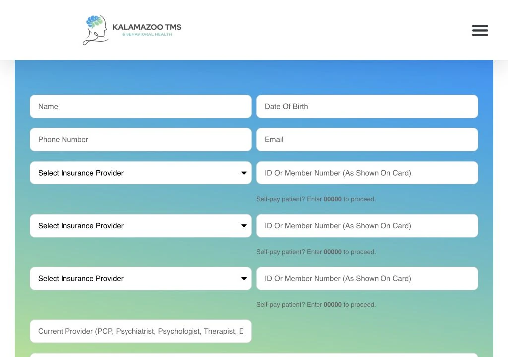
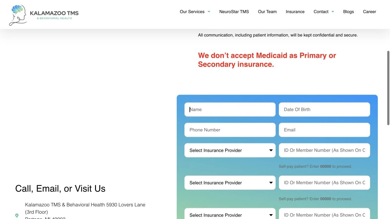
New patients, existing patients and referring providers arrive with different tasks. We designed a separate form for each, so the visitor can choose the appropriate request before sharing any information.
01
New patient request
People contacting the clinic for the first time can request an initial appointment and provide contact and insurance details for the team to review.
02
Prescription refill
Existing patients are directed to the patient portal. The dedicated refill form offers a fallback when they cannot access it, rather than treating the request as a new appointment.
03
Provider referral
Healthcare providers have a separate route to refer a patient, with fields for the referring provider and the patient. It is distinct from a general visitor inquiry.
Insurance information before the inquiry
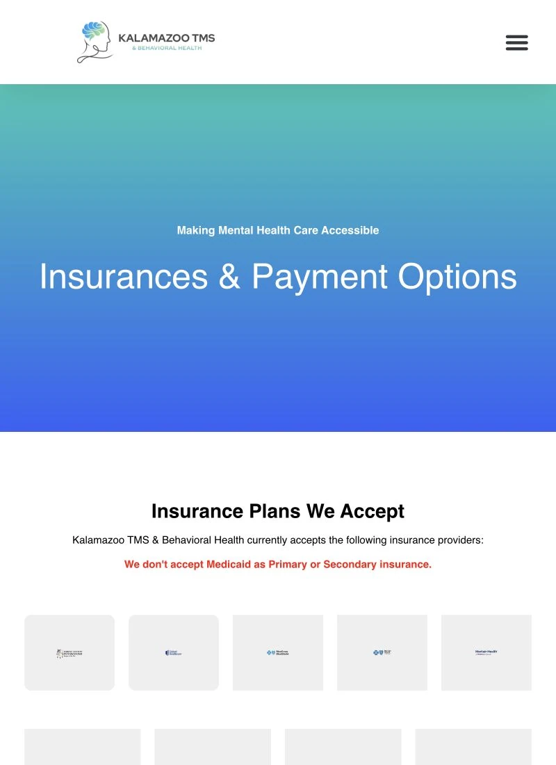
The insurance page puts accepted-plan and payment information in a visible destination. It also explains that patients should confirm their own coverage with their insurer before the appointment.
That information sits alongside the request route, where it can help someone prepare. The case-study images show empty public interfaces only; no patient records or submitted details are used.
The website keeps answering new questions
After the rebuild, the clinic still needed current information and a consistent public presence. We write and publish weekly blogs as part of the ongoing SEO and content work, while maintaining the website. Each article has a defined subject and a place within the site’s service structure.
The three published articles below address local treatment enquiries, clinical evaluation and insurance questions.
Depression treatment in Portage
A published article about evaluating next steps with the clinic.
TMS and Spravato evaluation
A published explanation of how the clinic evaluates treatment options.
Spravato insurance in Michigan
A published article addressing practical insurance questions.
The same clinic, beyond the website
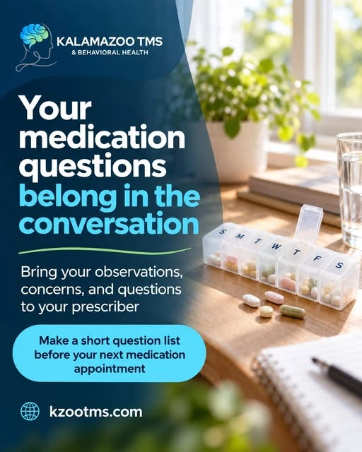
Social media management carries the identity into everyday posts. We provide the design and content, then manage publication. The clinic’s blue panels, logo and green accent line give different subjects a recognizable family.
These three original Instagram creatives show that treatment across a community post, a follow-up carousel and a medication-conversation reminder. They are published work, rather than reconstructed examples.
A clearer route into the clinic
Kalamazoo TMS now has a unified identity and a redesigned website with three specific request routes. Visitors can explore the practice, find insurance information and choose the form that matches their need.
The ongoing work keeps the website supported, adds weekly articles and carries the same visual language into social media. The clinic has a consistent way to introduce itself and keep useful information available as patients prepare to contact the team.
GET STARTED
SEE WHAT IS HOLDING YOUR WEBSITE AND SOCIAL MEDIA BACK
If people struggle to understand your services or find the right way to contact you, tell us where the journey breaks. We can discuss the identity, website and ongoing content together.