Arancia
An origami-led brand identity for a Canadian technology company, designed to carry consistently across digital materials and physical applications.
- Client
- Arancia
- Location
- Canada
- Business
- Custom software
AI transformation
Cybersecurity - Work delivered
- Brand identity
Logo design
Brand guidelines
Application direction
The work had moved ahead of the brand
Arancia worked in custom software, AI transformation and cybersecurity. Its identity was struggling to give that work a clear presence in the market. The branding felt weak, and applying it consistently had become a recurring problem.
A trade-show stall, a presentation and an online graphic each brought different demands. Arancia needed a modern identity that its team could use across those formats without having to make a fresh set of design decisions every time.
The brief was about everyday use
We set out to give Arancia a fresh visual direction with practical rules behind it. A distinctive logo would introduce the company; the guidelines would explain how to use it when the format, background or production method changed.
That meant considering small digital spaces alongside larger physical displays. The identity needed to remain recognisable in full colour and in a single tone.
The earlier identity
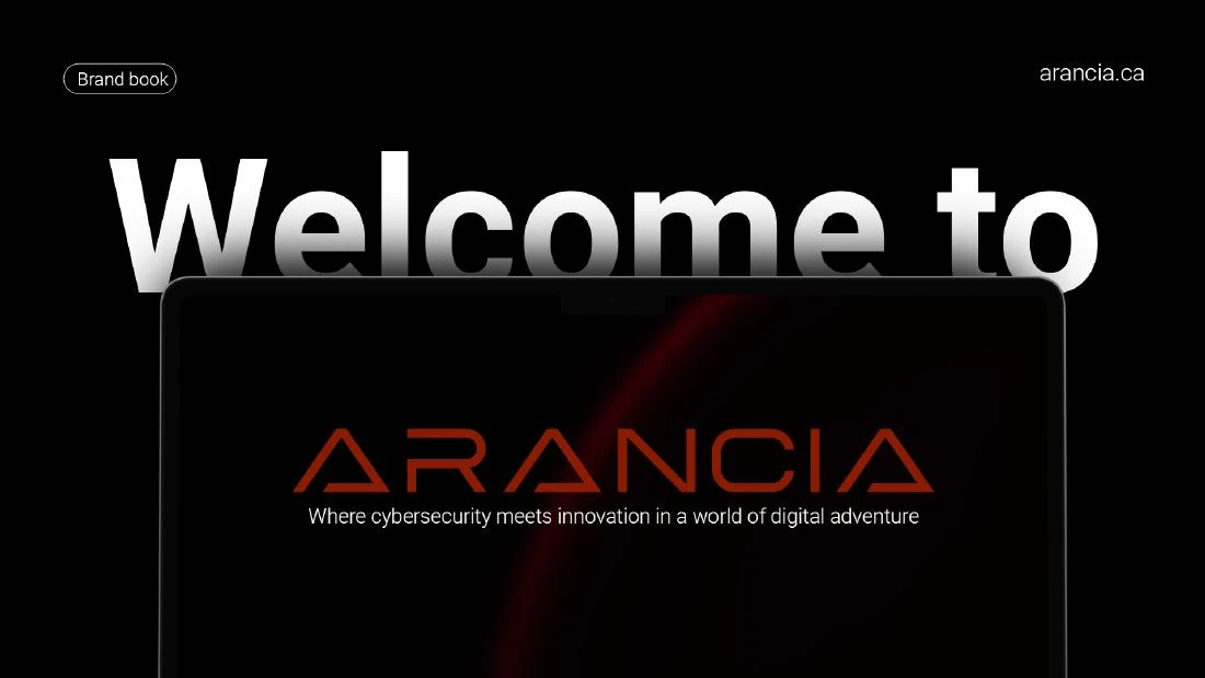
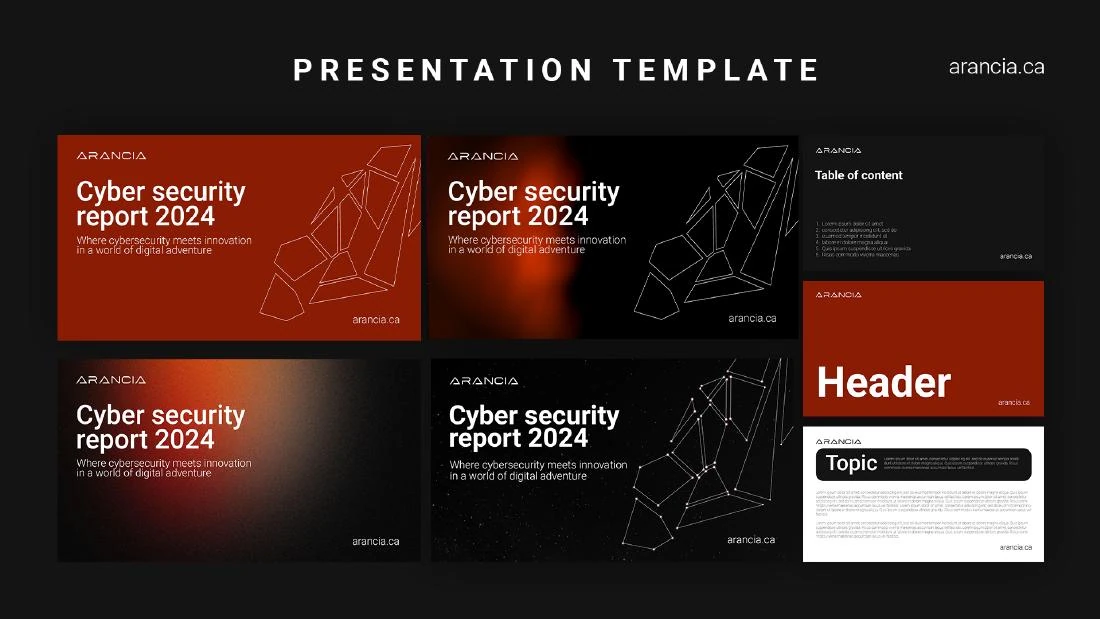
The earlier material used an orange wordmark and a darker graphic treatment. These supplied playbook pages record the starting point: an identity Arancia wanted to refresh and make easier to apply. They are shown here as the previous branding, not as the final artwork.
Origami gave the identity its shape
We drew on Japanese origami to develop the folded A. Its angular planes create a compact mark, while violet and teal gradients give the folds depth. The wordmark sits beside it in a horizontal lockup; the symbol can also work on its own where space is limited.
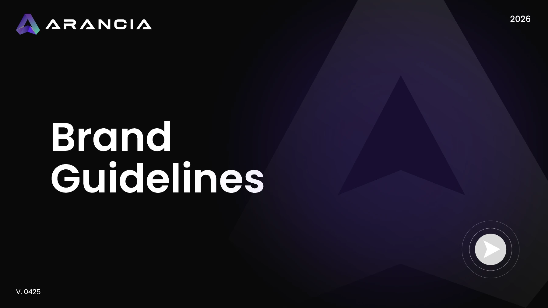
The guidelines document the logo variants, clear space and minimum size. They also establish the colour palette, Poppins and Inter typography, icon treatments and imagery direction. The outlined A and arrow details give layouts recognisable elements beyond the logo itself.
FINAL IDENTITY / MONOCHROME ON LIGHT
FINAL IDENTITY / MONOCHROME ON DARK
An identity that travels with the company
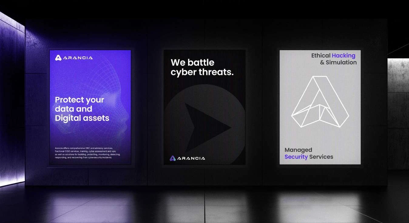
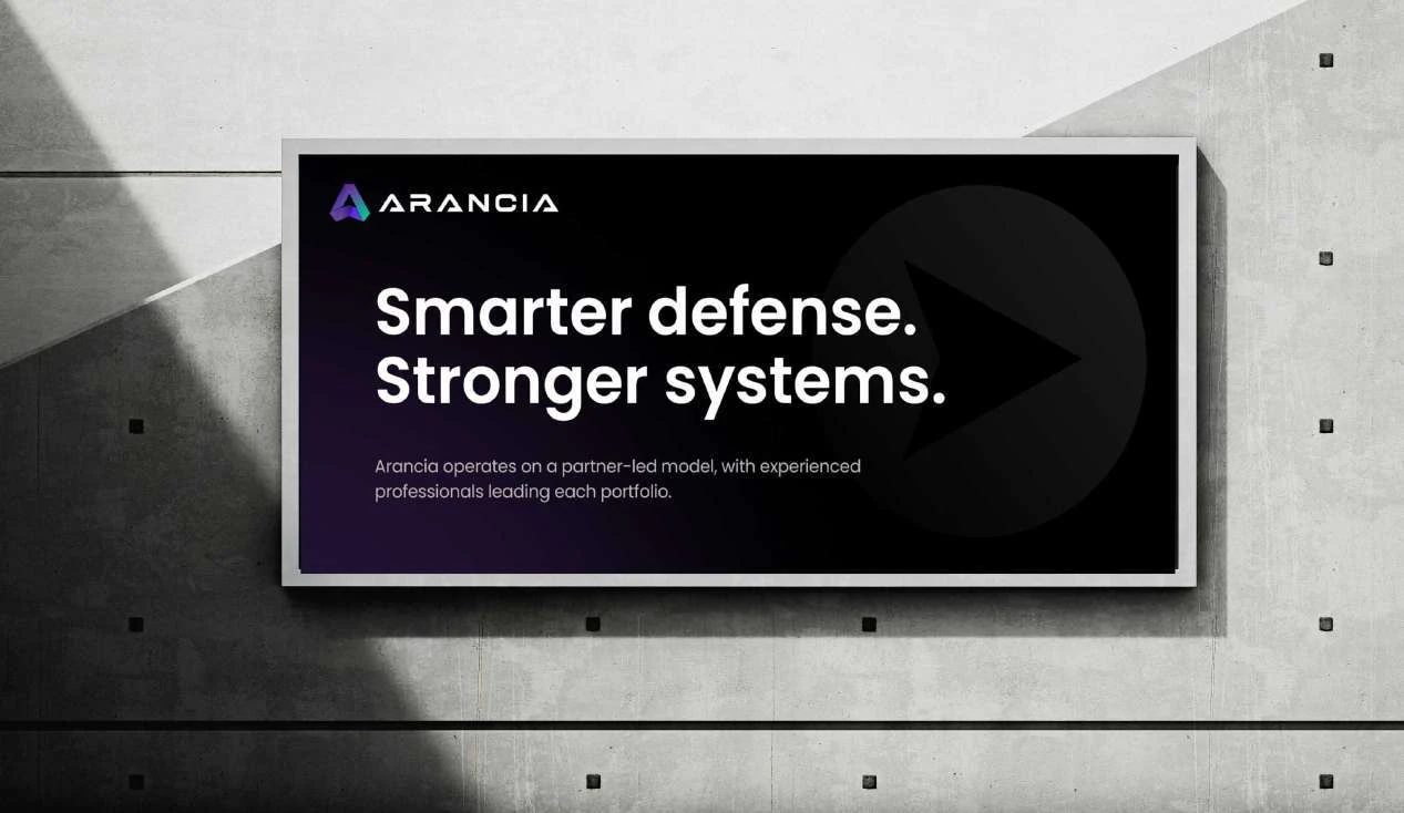
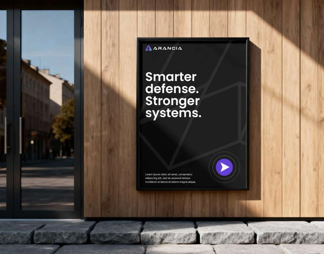
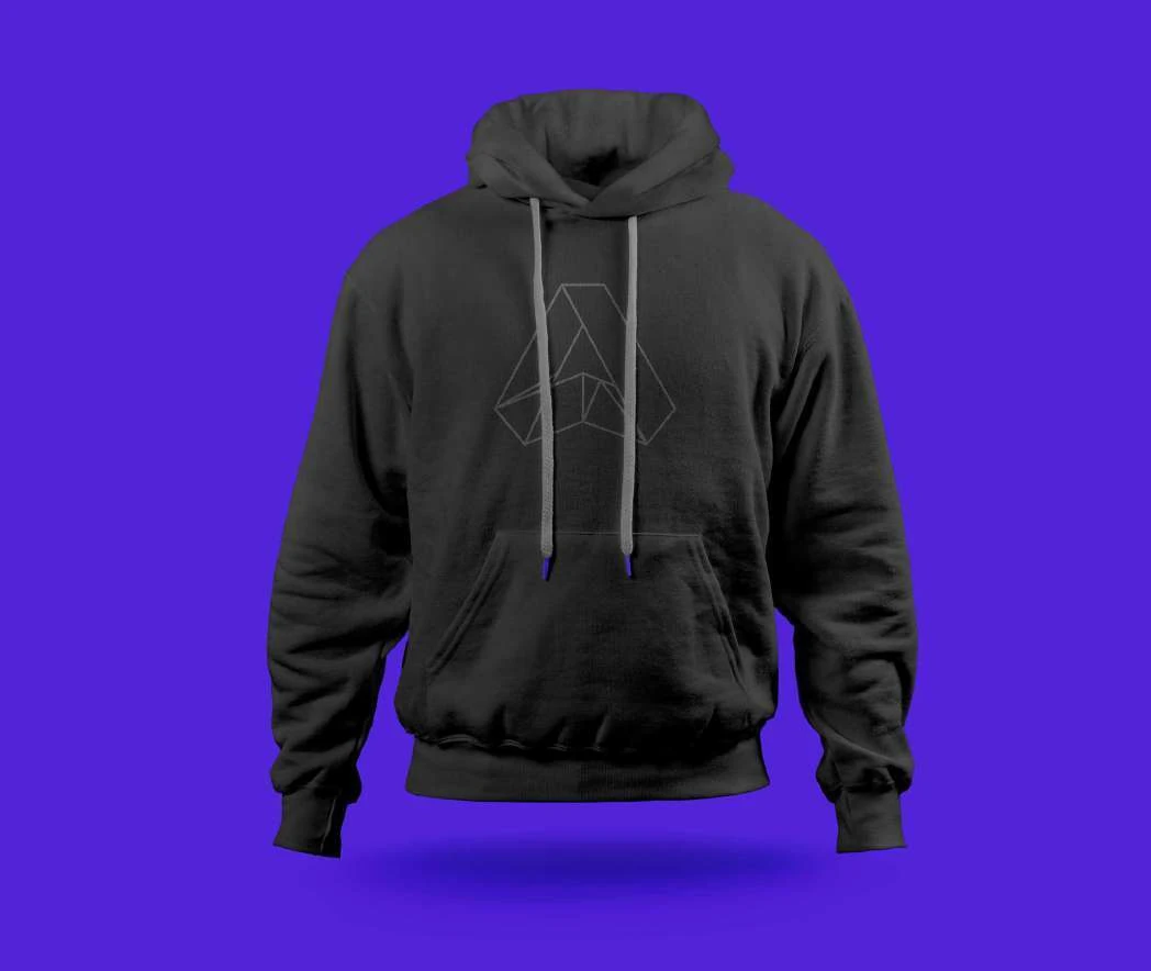
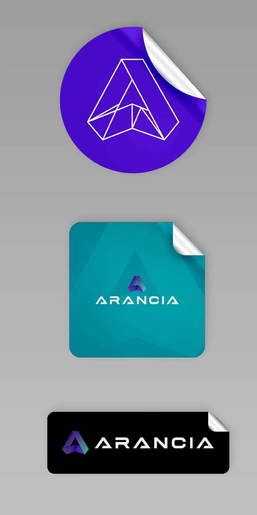
The application work brings the rules into view. Signage pairs a clear headline with the folded mark or its outline. Clothing uses simpler treatments suited to a smaller print area. Sticker examples show how the full-colour logo and outlined symbol can carry the same identity in different spaces.
For the trade-show brief, these decisions matter: a large display needs a recognisable mark and readable information, while smaller supporting pieces need to belong to the same company. The guidelines give future materials a shared starting point.
The images below are original application mockups from the supplied brand guidelines. They demonstrate the design direction; they are not a claim that the pictured signage or merchandise was manufactured or installed.
A recognisable identity, with rules to use it
Arancia received a new origami-led identity and a documented guide to its use. The logo variants and supporting elements give its team choices for different formats while keeping the brand recognisable.
The handover addresses the practical difficulty at the heart of the brief: knowing which artwork to use and how it belongs in a layout. It gives future digital and offline materials a consistent visual foundation.
GET STARTED
SEE WHAT IS HOLDING YOUR WEBSITE AND SOCIAL MEDIA BACK
If your identity is difficult to use across everyday materials, tell us where it breaks down. We can discuss the logo, guidelines and applications together.