AdwiseHer
Branding and website design for a new executive-coaching business. From the first wordmark to the first discovery call.
- Client
- AdwiseHer
- Founder
- Anam Tareen
- Sector
- Executive coaching for women
- Location
- Kalamazoo, Michigan
- Work delivered
- Branding
Logo design
Brand guidelines
Website planning & design
Keyword & competitor research
Content writing
Client photography
A coaching business finds its voice
Anam Tareen was starting AdwiseHer, an executive-coaching business for women. Before someone could book a conversation, they needed to understand who the coaching was for, what the programs covered and who would guide them.
Digital Osmos helped shape that first introduction. We began with the brand, logo and guidelines, then planned and designed a website around the programs and the person behind them.
One introduction, from identity to booking
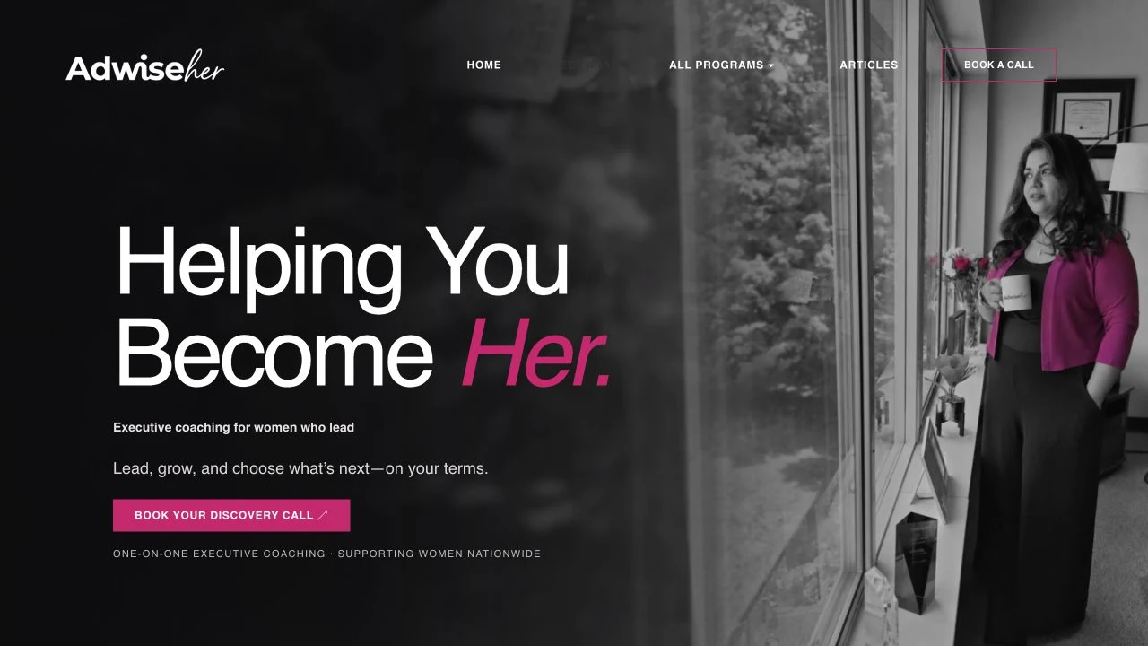
The identity and the website were developed as parts of the same project. The wordmark gave AdwiseHer a recognizable name; the guidelines gave future work a consistent visual foundation. The website carried that identity into program pages, Anam’s introduction and a route to a discovery call.
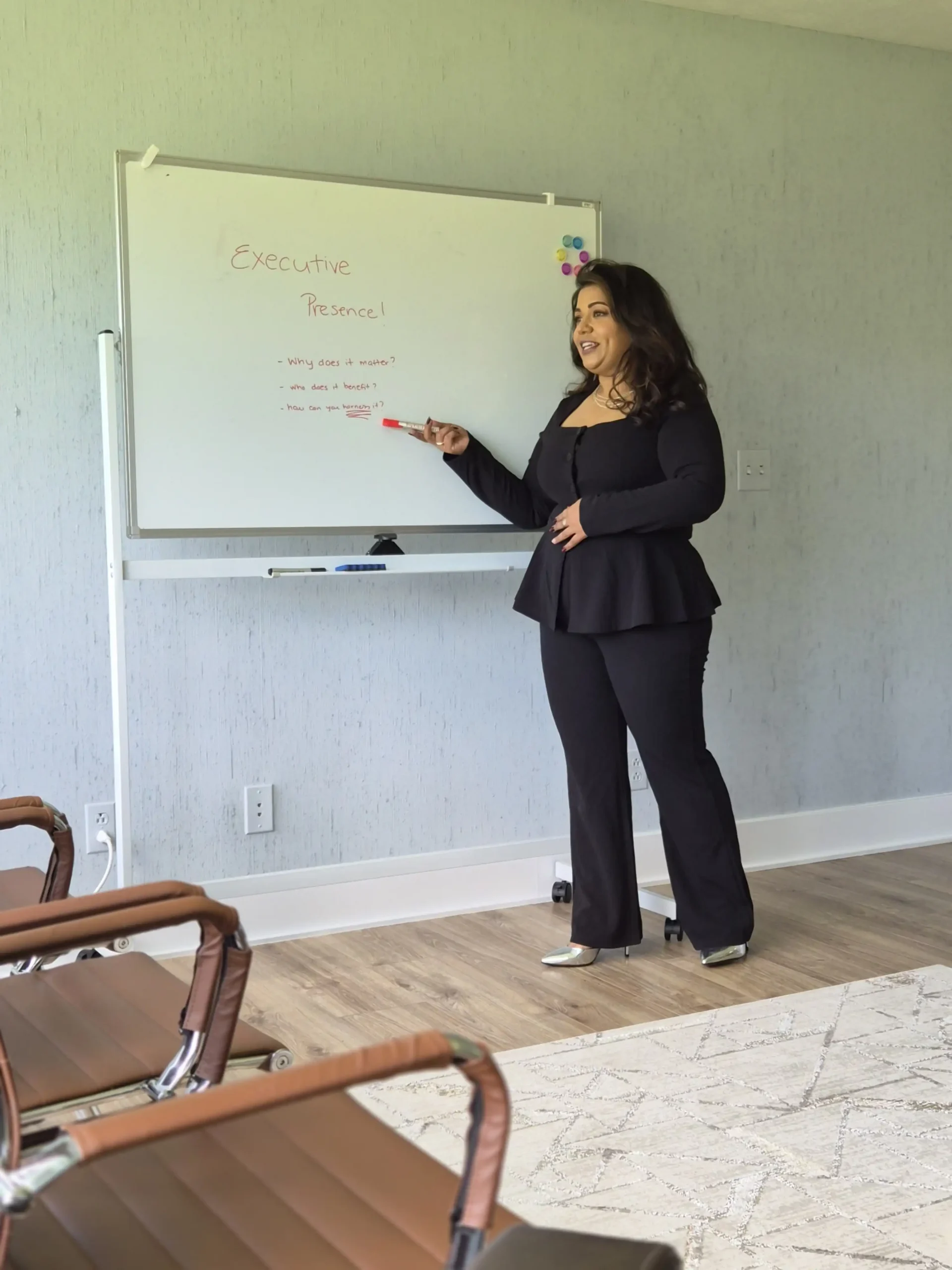
Our team also photographed the client. Those original images let visitors meet Anam through the website before speaking with her.
An identity ready to be used
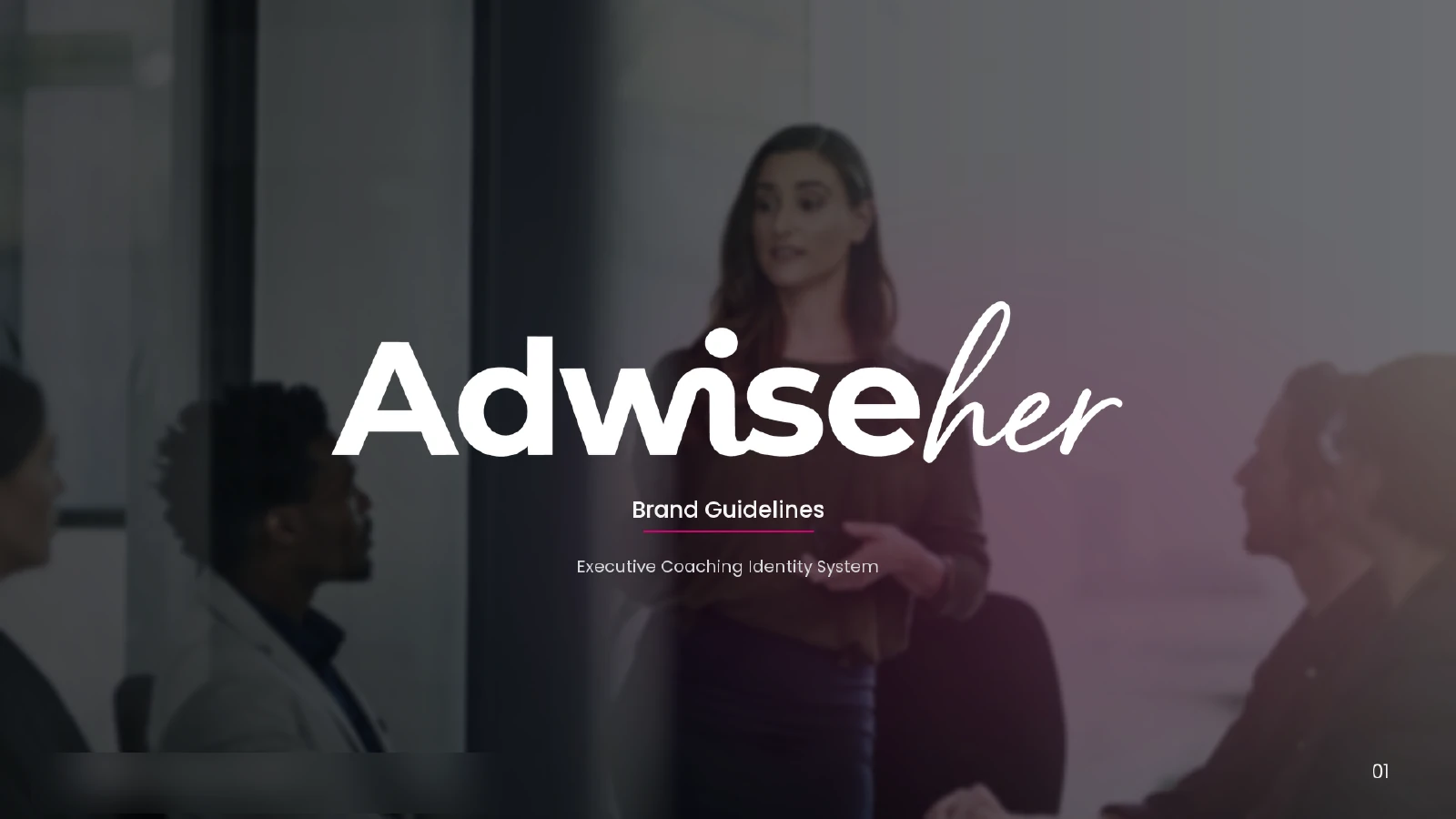
We created the AdwiseHer logo and documented how the identity should appear across its materials. The brand guidelines bring together the full-color wordmark, white version, compact Ah monogram and typography.
Playfair Display gives the brand its editorial character, with DM Sans supporting the everyday reading. The original artwork below shows how those decisions were recorded for consistent use.
ADWISEHER / ORIGINAL WORDMARK
ADWISEHER / WHITE WORDMARK
The website began with the business
A coaching website has to explain the offer before it asks for a booking. We worked through the structure, research and writing first, then gave that information a visual form.
Business taxonomy
Executive Presence, Personal Brand and Career Strategy & Style each received a program page. Anam’s introduction, articles and the discovery-call destination completed the structure, giving every part of the offer a clear home.
Navigation experience
Visitors can meet Anam, explore all programs and read the offer that interests them. Each program page connects that information to a discovery call, without sending the visitor back through the homepage.
Keyword research
The keyword map assigns broad executive-coaching searches in Kalamazoo to the homepage. Executive presence, personal branding and career strategy each have a program page; informational questions belong with articles. Each page has a distinct purpose.
Competitor analysis
We considered how coaching offers were explained, how the coach was introduced and how visitors reached a booking. Those questions focused AdwiseHer’s presentation on clear programs, a visible founder and an understandable next step.
Content writing
The copy explains who each program is for and what a visitor can explore next. Anam’s introduction and the program pages provide context for a discovery conversation, with booking close to the relevant information.
Design research
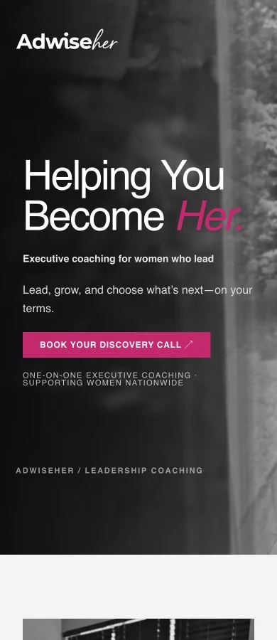
Research informed the page layouts, visual hierarchy and photography. The website carries the identity’s magenta accents, editorial typography and wordmark into a consistent interface, with original portraits introducing the person behind the coaching.
The person behind the coaching
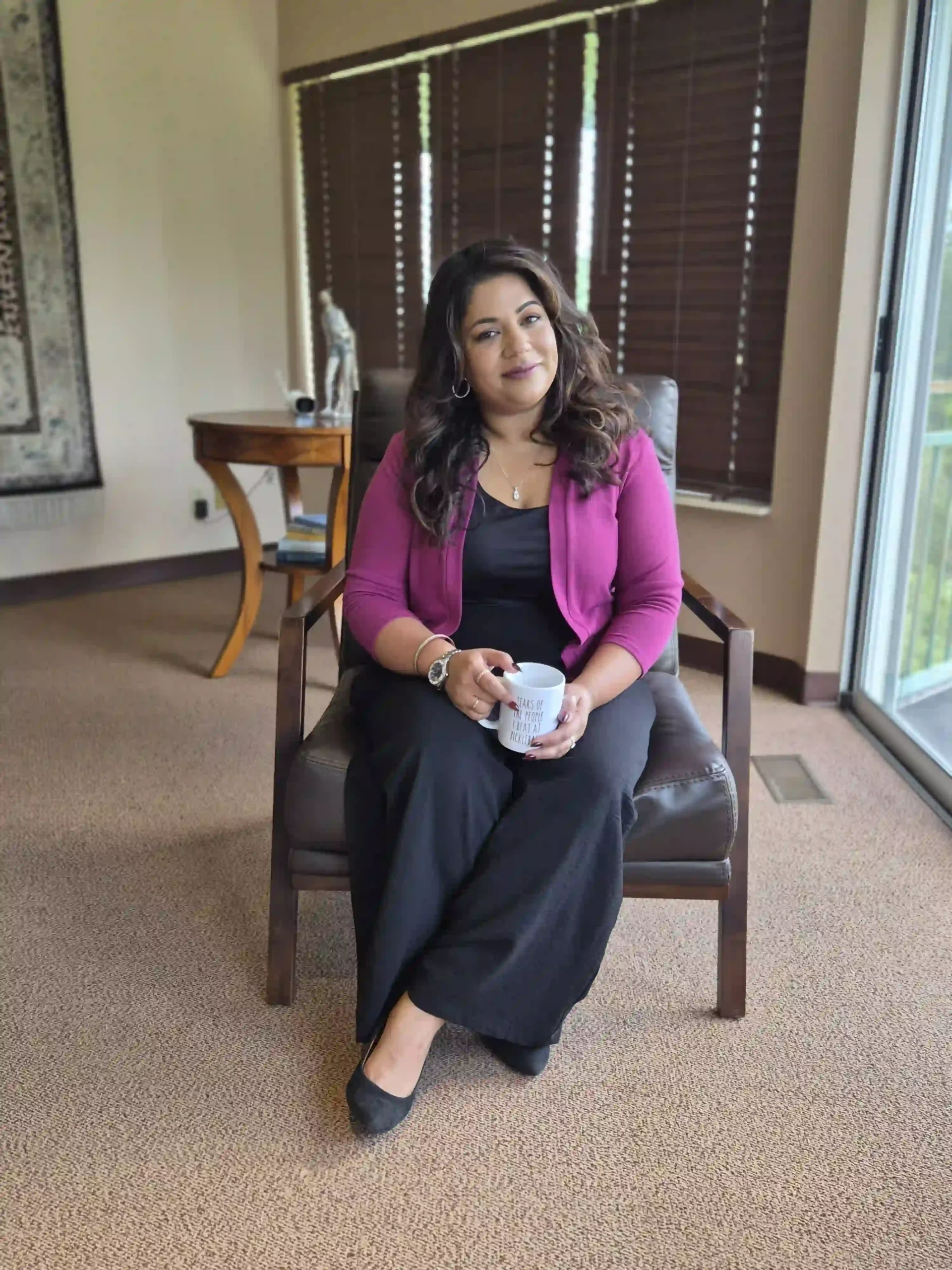
Our team photographed Anam for the project. The shoot included an office portrait and a working scene beside the whiteboard, giving the website images of the actual founder in her own professional context.
These are photographs from that shoot. The device scenes elsewhere on this page are illustrative mockups; the client images below are original photography.
A brand with a website of its own
AdwiseHer now has a logo, documented brand guidelines, original client photography and a live website. The site brings its coaching programs, founder introduction and discovery-call route into one place.
Someone meeting the business for the first time can explore the offer, get to know Anam and decide whether to book a conversation. The identity provides a consistent foundation for what the startup creates next.
GET STARTED
SEE WHAT IS HOLDING YOUR WEBSITE AND SOCIAL MEDIA BACK
Tell us what you are starting and what your website needs to explain. We can discuss the identity, content and design together.